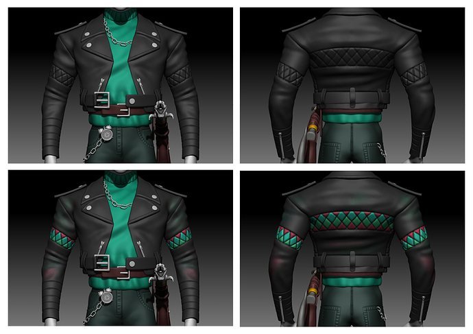
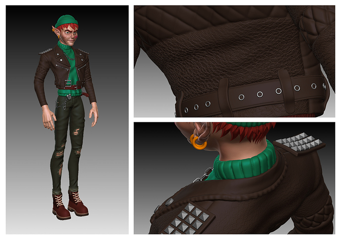
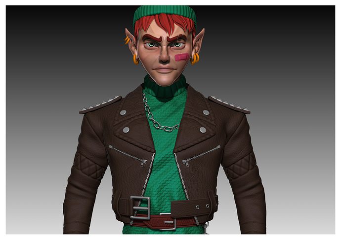
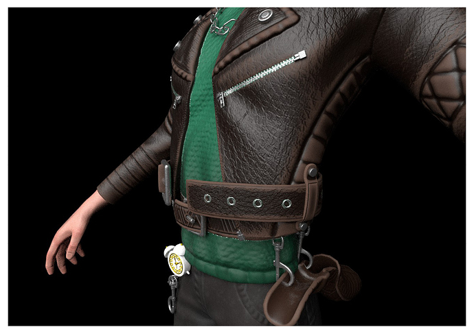
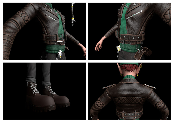
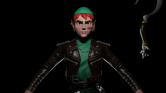
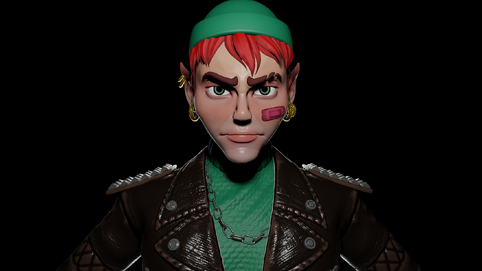
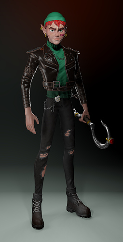
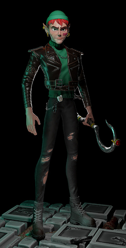
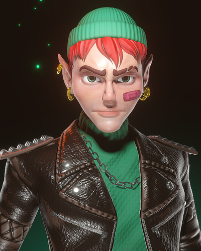
I thought about adding some colours to the perfecto to create some kind of a link with the Neverland and native american background but, for cultural puropose and aesthetic too, I’m not sure… I keep both versions and will see later.
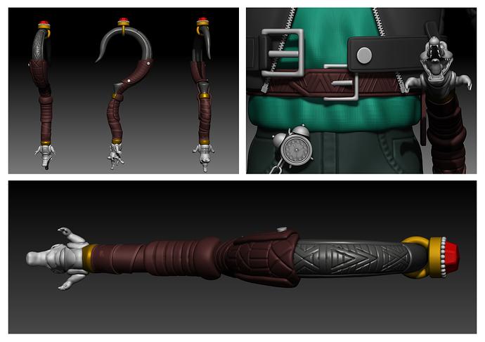
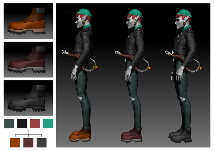
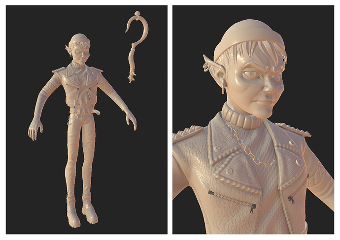
Hi everyone. I slowly started adding more details to everything. On the hook and the belt. Plus, I modeled the shoes and I’m wondering wich colours I should pick… I think the brown version is the better one but I’m not sure. Would be pretty cool if someone could help me with this dilemma 
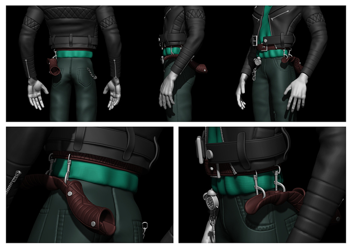
Today, I found a… pretty simple way to hold the hook. First, I wanted to do something more conventional then I thought that this version of Peter Pan could have more steel pieces and could have use simple way of holding his weapon… like carabiners 
I think it’s in tune with his overoll rock’n’roll style.
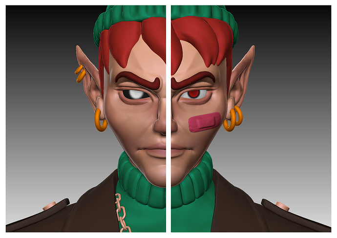
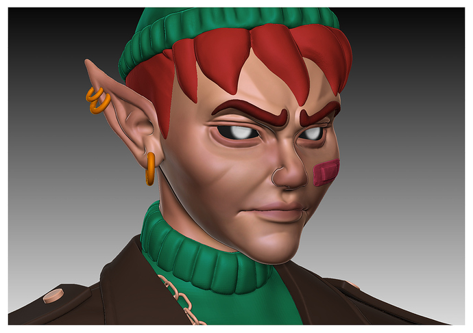
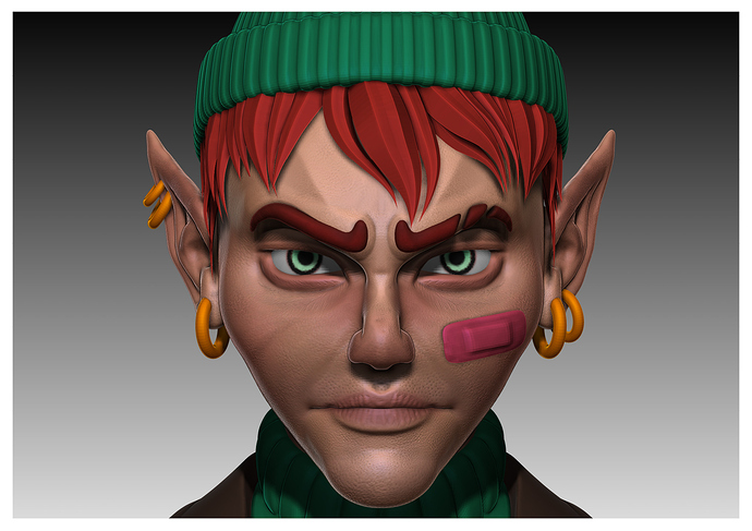
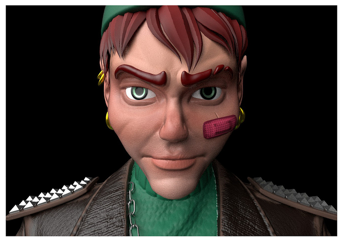
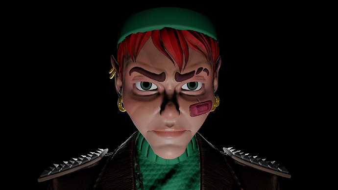
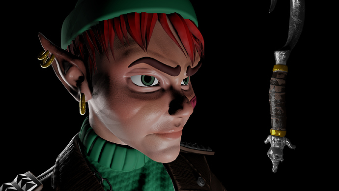
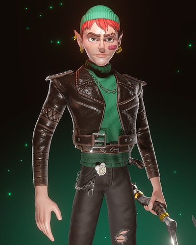
I’ve started adjusting the face a little bit, closing his mouth and adding some colours. Right now I’m hesitating about the color of the eyes. Black eyes would make him more badass and guive him this “dark elf” style I was looking for with the Outsider from Dishonored reference but red eyes would make him more “kinky”/ endearing.
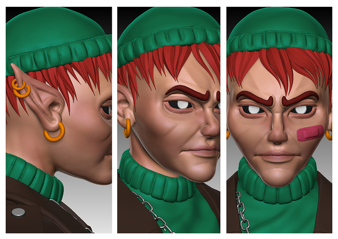
I’m trying to add more complexity to the hair with the IMM BlackDiamond Brush I purchased on Flipped Normals. Asking myself what should I do with the eyebrows. I figured out that I’m kind of doing an Overwatch’s style here.
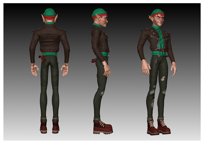
I think I found what I was looking for with this character. Everything’s not perfect at all, but I’m happy.
It was so hard to think about the design and sculpt in the same time (so much easier to sculpt from a concept).
The design’s almost done. I’m gonna jump into the technical part after detailing and polishing everything.
Hi there,
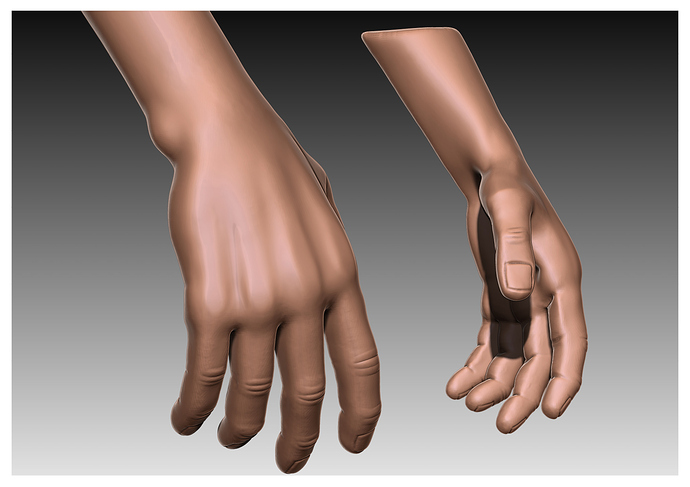
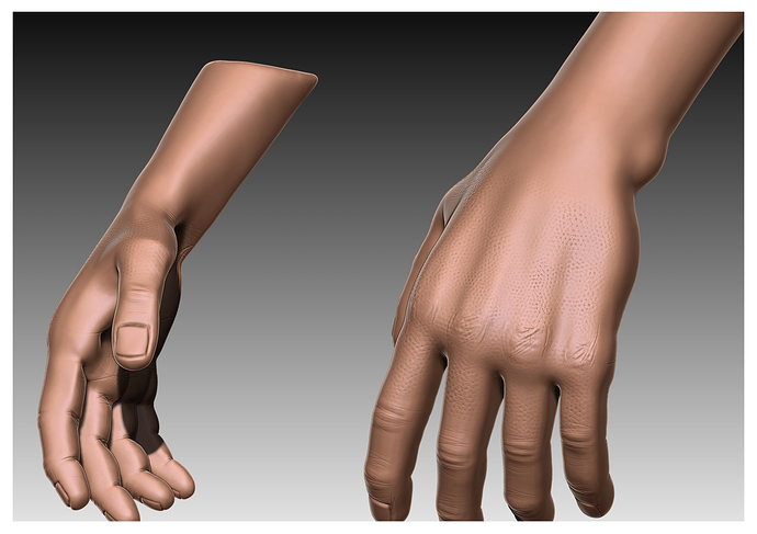
Among other things I fixed the hands today. I thought about putting some mitten on it, I made it but I think simple bare hands work better.
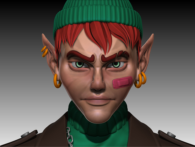
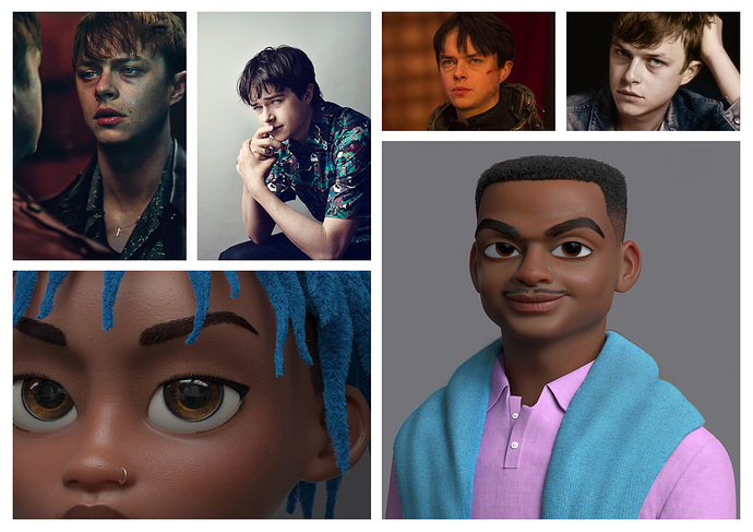
Here are some ref I used later on. Dan Dehaan was one of the first that inspired me for my first 2d concept, I used it later on when I decided to put those green eyes and angry face to my Peter Pan.
In therms of visual aspect, Guzz Soares is a big inspiration for me, in general, I think this guy found a well balanced design with caricatural shapes but real details on skin, hair and materials.
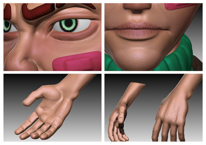
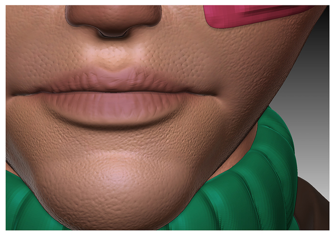
This is (almost) the first time I’m making a character from start to finish so I try to do it properly. I only experimented skin detailing once but I enjoyed it a lot so I’m right back at it.
wow i really love how you nailed damon albarns aesthetic
but are you sure you want to make the skin so realistic with wrinkles etc.?
isn’t that gonna be uncanny?
Do you think it’s already uncanny? haha
Yeah I’m pretty sur about it because I know that I don’t want him to be realistic, it’s a caricature right and those wrinkles and details are just kind of “materials”, uncanny would come if I have wanted to make my overall shape realistic (proportions, details, etc… and again, that’s what I think, I’ll see the result in the end and maybe you’re right haha).
I’m far from being as good as they are, but look at Guzz Soares’s work (https://www.artstation.com/guzz), or Crystal Bretz (https://www.artstation.com/artwork/ba9Rqv), or work from Illumination Mac Guff for Despicable me (https://www.illuminationmacguff.com/?lang=fr), and others… They all do caricature but with a touch of realism on materials and skin 
By the way, the artist who made the drawings for Gorillaz is not Damon Albarn himself, his name is Jamie Hewlett. I’ve always been inspired by his work since I draw characters.
Thanks for your feedback Gloria 
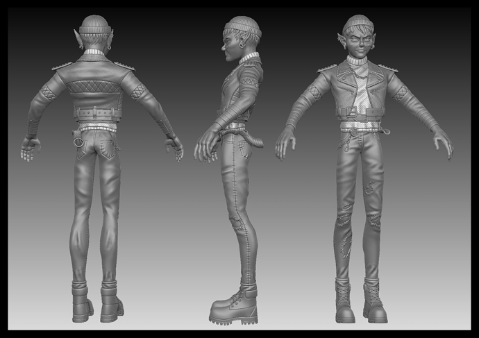
Here’s my HP. I just need to fix some issues related to my polycount and undo history (f’you know what I mean…  ) add a little bit more details to the pant and accessories and I’m good to go right to retopology Maaaaaaaaamen. Can’t wait to work on colors and texture for this character.
I’m not pretty satisfied with the bottom part of the pullover I will see what I can do with it.
He looks like he had hard times) Good idea!
Yes he had a burnout after realizing that Neverland never existed o.O
Thanks Gibbon 
Here’s my final HP (for now), I jumped in retopology yesterday. I’ll share some sneak pics when I’ll be a litle more advanced.
Hope I’ll make everything work 
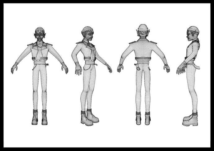
Hi everyone. I almost finished my retopology.
Oh Yeah, just one thing : I spend soooo much time on the retopology of the hair, I’ll be carefull with hair in my future projects 
In regards of what I did, I aim for a 80k polycount with the hook and everything. Goes high pretty fast 
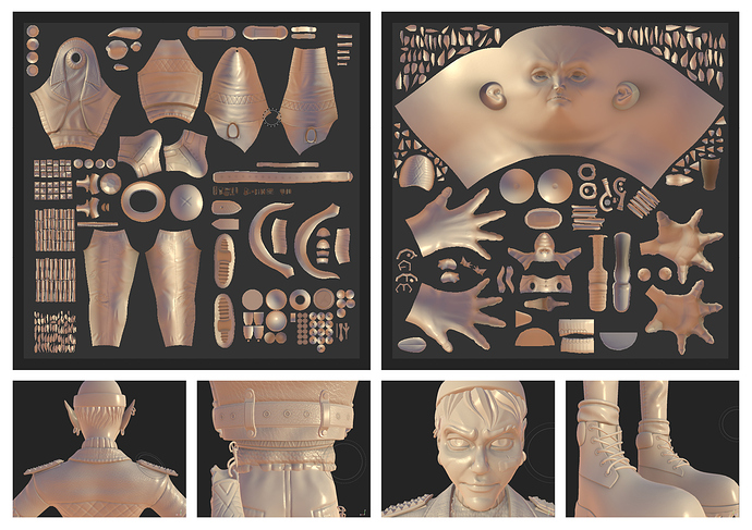
Finally I can post a little something here  . I finally finished the retopology of dear Mr. Pan and baked it into Substance. Can’t wait to start adding some colours and finally bring this character to life. Also, I’ll have some tweaks to do with some mesh that are overlapping on each other. And I have a little problem with ears haha… Gonna fix it.
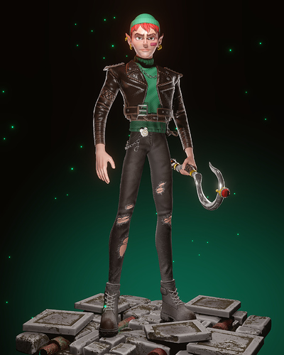
Here’s a little render made with Eevee Blender for my own pleasure. After this I had to do some corrections with the mouth. That’s the first time I finish a game-ready character so I got use to make a lot of mistakes. This challenge made me learn a lot of things.
While I’m taking a little break I’m thinking of everything I want to improve or change but I’m gonna finish a first version of this chararcter for the challenge and I’ll improve everything later.
Here is my final submission, you can check everything here. In spite of the big fundamental mistake I made, I’m happy I did it 
You can inspect it on Sketchfab : https://skfb.ly/onR6C
