Here’s a base I created for the challenge. I’ll work on getting his body type down to something I want to work with and then begin with assets.
Changed the body shape and I’ve begun some high poly details. I’m still likely to change the a lot of the body.
The body has be been retopo’d, and so have the trousers.
Still loads of work to get through!
Feedback is more than welcome!
*Edit - I’ve realized the head is a bit too out of proportion
Starting to take shape a little, but still loads to do. Hair cards are in.
I’m mainly working on giving the character more of a personal touch from now on, and then progress to tattoos.
Currently at 33K tris at the moment. Only a few more assets to make, however I’ve already got some areas in mind I can shave down if I need a lower final poly count! Really excited to get this dude into substance - got to get through Uving first though haha.
Looking pretty cool
Quick Update:
Currently in Substance at the moment, and feeling pretty happy about where I’m currently at. I feel like I’m about 70% complete, however there are some small things I’ve got to sort out. I’ve also got to create a few more tiny props because he’s looking pretty bare.
Going to spending a bunch of time doing some lookdev from now on. I potentially have a finished piece, but I feel like he’s missing some things. Pose/facial expression isn’t final, and same for the cane. I really wanna make sure the finished product looks as good as I can get it, rather than upload the second it looks done.
I’d really love to hear some feedback!
Hi there, I really enjoy your theme.
As for some feedback, mind you I´m no expert at all, the proprotions, especially the legs are off for me. The legs should normally be longer, in whole size they often make 50% or even more of the height of a human.
You may also try some color with your tattoos. They are too toned down and dont pop so to speak. Looking at your reference, I think you want them to be more important.
About your clothing, it looks pretty samey and doesnt differentiate from each other. Give them more contrast in brightness and a small color change.
Those are my thoughts in him. Keep it up and technically speaking, this character is on a pretty good level.
Thanks @Atherran ! I really appreciate you taking the time to give some feedback. I 100% get what you mean about the legs, I was thinking they looked a bit short, but I originally thought it was the clothes. Messing around in photoshop, i really think the model benefits having longer legs - great observation.
I’ll get on working on the other aspects you’ve pointed out.
Thanks again!
Very impressive! You are very fast!
Very nicely done! I don’t think it is bare as you put it. You could take a “less is more” approach and work more on the background of the character through texture. What i would love to see is a more interconnected approach to his tattoos instead of the same celtic tattoos. Either way, love the execution, keep it up!
Thanks @Fepuo ! That’s an interesting take, maybe staring at it for too long, thinking about ways to improve and what to add is a flawed approach. Some times less is more, and I should maybe bring out the expression of the character more as a way to portray more of a story.
I’m also currently working on adding more tattoos at the moment as well!
Thank you for your feedback, I look forward to keeping an eye on your project - it’s already looking great!
Weekend update! I’ve decided that I’m going to aim to post the final piece on Monday - Tuesday at the latest. I’ve really enjoyed the challenge this far, but I feel like any artist staring at their work too long, they can always find different problems with it.
I plan on not working on him today and come back with final finishing touches with fresh eyes tomorrow!
I’m also tempted to attempt the VFX character challenge, but I’m not sure if I can enter both?
I hope everyone has a great and productive weekend!
Great strategy !! … i follow your strategy when my small work don’t convince me.
New eyes … new ideas.
A few more finishing touches and I should get my final renders up on the submission forum. Looking at tomorrow!
This is my final post in the WIP thread, I have uploaded my final piece to the submission thread: Warlock Challenge - Real-Time Game Character - Final Submissions
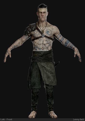
Here is the final T-pose, you can see the final images above!
Thank you to everyone that has given feedback , I can’t wait to see everyone’s final pieces.
I’ll also be keeping an eye out on the WIP threads and give some feedback for areas I feel I might be able to help.
Congrats on finishing !!!
Congrats on this amazing piece of work! We’ve featured you in our challenge update newsletter which just went out
Thanks for the kind words
That’s awesome! Thanks for giving the submission exposure!
Absolutely - you deserve it I’ll see what I can do to get it featured on our social media too in the coming days